What is the font of Nike?
Nike uses a bold, simple sans-serif font for branding. Many people ask what exact font Nike really uses. The answer is interesting and not very simple. Nike changed its fonts many times over the years. Each change matched culture design trends and business goals.
The most famous Nike text logo feels strong and clean. It often appears next to the famous swoosh mark. People think the font is custom-made for Nike. That idea is partly true and partly mistaken. Nike mixes custom tweaks with existing font styles.
Understanding the Nike font helps designers learn branding basics. Fonts send feelings before people read any message. Nike wants power, speed, and confidence in letters. The font choice supports that clear bold message. Now, let us explore the details step by step.
Table of Contents
The Original Nike Logo
Nike started in nineteen seventy-one as Blue Ribbon Sports. The first logo looked very different from today. It used a simple serif style with thin strokes. That early design did not feel sporty enough. Soon, the company wanted a stronger visual identity.
In nineteen seventy eight, Nike redesigned its main logo. The new logo uses uppercase bold sans-serif letters. This version placed the swoosh under the text. The letters looked wide, heavy, and confident. That redesign shaped the future Nike brand image.
The Famous Futura Connection
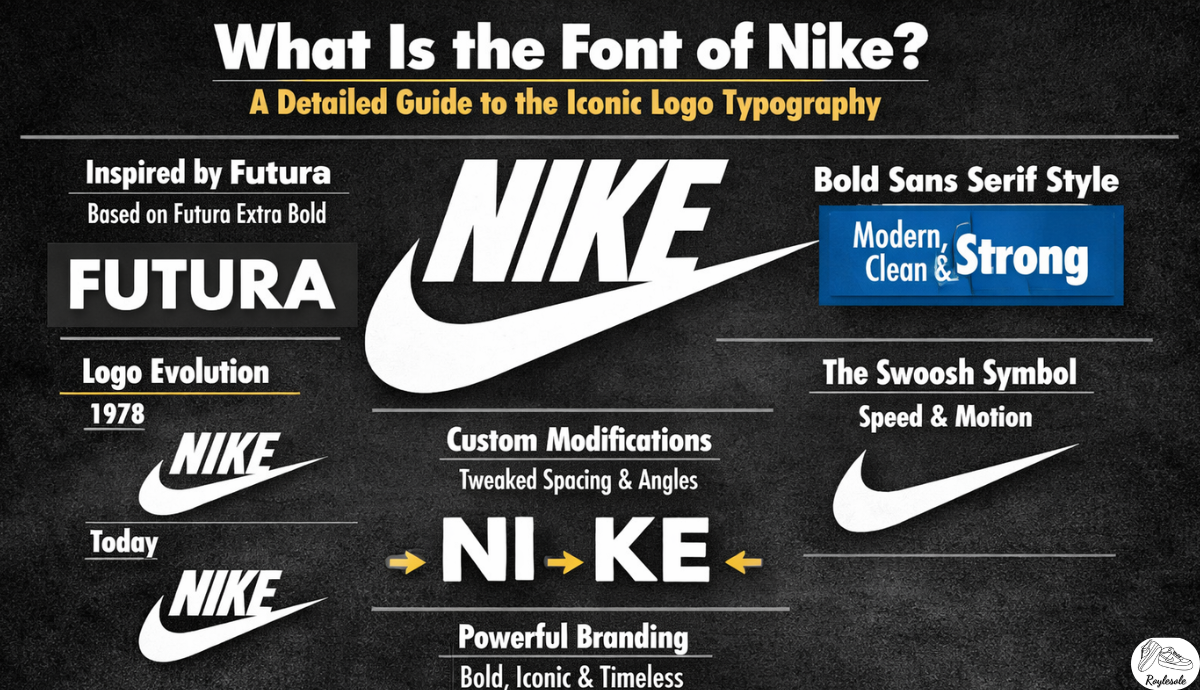
Many experts link the Nike logo to Futura. Futura is a geometric sans-serif typeface. It was designed by Paul Renner in Germany. Futura feels modern, clean, and very balanced. Those traits match the Nike brand personality quite well.
However, Nike did not use pure Futura exactly. Designers adjusted letter shapes for better impact. The spacing between letters was also customized carefully. These small edits made the logo unique. So the Nike font is inspired but not identical.
Why Nike Uses Sans Serif Fonts
Sans-serif fonts have no small finishing strokes. They look clean, direct, and easy to read. Sports brands prefer this strong visual clarity. Nike wants movement speed and sharp energy. Sans-serif letters support that athletic feeling.
Serif designs can feel formal, classic, or traditional. Nike rarely wants that old-fashioned mood. The brand focuses on youth action and strength. So simple, bold letters fit better. This choice keeps the logo timeless and flexible.
Custom Modifications in Nike Typography
Nike often adjusts designs for marketing campaigns. Designers stretch, compress, or reshape certain letters. These changes keep visuals fresh and interesting. Still, the core bold style stays consistent. Consistency builds trust and brand recognition.
For example, the letter N sometimes looks slightly angled. The letter E may have tighter spacing. Such tweaks are small but very important. They help the logo look powerful in print. They also improve clarity on digital screens.
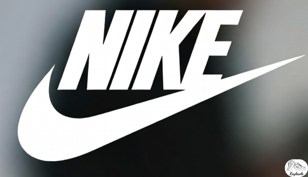
The Role of the Swoosh Symbol
The swoosh symbol works closely with the font. It represents motion speed and forward movement. The text must balance that dynamic shape. So designers chose stable, heavy letterforms. This contrast creates harmony within the logo.
Without the swoosh, the font still feels strong. But together they form a complete identity. The swoosh adds emotion, while text adds clarity. Both parts support each other perfectly. This teamwork makes Nike’s branding unforgettable.
Nike in Advertising Campaigns
Nike ads sometimes use different supporting fonts. These fonts still follow a bold sans serif style. They match the main logo personality closely. This keeps every campaign visually connected. Even posters feel clearly part of Nike.
Campaign slogans like Just Do It use bold fonts. The letters appear simple, strong, and direct. They speak like a coach giving advice. Short words and clean fonts feel motivating. Typography helps the slogan hit harder.
Digital Use of Nike Typography
On websites, Nike uses modern web-safe fonts. These fonts load fast and stay readable. They often resemble Futura or Helvetica styles. Clean lines look sharp on phone screens. Digital clarity matters for online shopping.
Nike also uses responsive typography techniques online. Text sizes adjust for different screen widths. Spacing changes slightly for better readability. Yet the bold, sporty feeling remains. Strong typography supports a smooth user experience.
Comparing Nike with Competitors
Adidas uses a different but still bold design. Its letters look slightly more condensed. Puma uses sleek, modern sans-serif typography. Each brand wants a unique visual identity. Small differences create strong brand separation.
The Nike logo feels balanced between classic and modern. It is not too fancy or experimental. That balance helps it last many decades. Trendy fonts might fade very quickly. Nike avoids that risky design mistake.
How Designers Identify the Nike design
Designers compare letter shapes to known typefaces. They study curve spacing and stroke thickness. Many conclude it resembles Futura Extra Bold. Others mention the Avant-Garde as similar. Still, none match perfectly without edits.
Some websites offer Nike-style logo downloads. These are usually close imitations, not official. Nike owns its logo as a protected trademark. Using it commercially without permission is illegal. So designers must be careful and respectful.
Evolution of Nike Typography Over Time
Nike refined its logo several times quietly. Changes were subtle, not dramatic or shocking. Edges became smoother, and spacing improved. The swoosh also shifted position slightly. Each update felt natural and thoughtful.
The current logo removes the box around text. Earlier versions had a red square background. Now the simple black text stands alone. This minimal look feels confident and mature. It shows how strong the brand became.
Psychological Impact of the Nike design
Bold fonts create feelings of power and authority. They suggest confidence and strong leadership. Nike wants customers to feel unstoppable. The typography supports that emotional goal. Letters look ready to move forward fast.
Simple shapes also build trust and clarity. People read them quickly without effort. This speed matches sports and action themes. The font speaks even before words sink. Good typography shapes silent brand messages.
FAQ’s
What exact design does Nike use today?
Nike uses a customized sans-serif style. It closely resembles Futura Extra Bold. However, designers modified spacing and shapes. So no free fonts match it perfectly.
Is the Nike design free to download?
The official Nike logo is protected. You cannot legally use it commercially. Some similar fonts are available online. Always check licenses before any design project.
Why did Nike choose a sans-serif logo?
Sans-serif fonts look modern and strong. They match sports themes of speed. Nike wanted clean, powerful brand communication. This style supports clear, confident messaging.
Has the Nike design changed over time?
Yes, the logo has evolved slightly. Changes improved spacing, balance, and sharpness. The bold style stayed consistent. Subtle updates kept the brand fresh.
Can designers create a Nike-style look?
Designers can use geometric sans-serif fonts. They should avoid copying the exact logo. Focus on bold spacing and clean lines. Original creativity is always more valuable.
Conclusion
The Nike design is mainly inspired by Futura. It is customized carefully for unique branding. Bold sans-serif letters express strength clearly. Small adjustments make the logo special. This mix creates timeless visual power.
Understanding Nike typography teaches strong branding lessons. Fonts are not random decoration choices. They shape emotions and guide customer perception. Nike proves simple design can feel iconic. Strong, clear letters truly carry big meaning.


Post Comment